No matter where your business niche is, you know that it cannot thrive properly without a sound online presence and a great website design. There are many factors that surround a proper online marketing strategy. But one of the first things that your target customers will notice when they land on a page of your site is the website design.
From the visuals to the functionality, you better bet that how you design your website is going to affect how your customers perceive your brand. Your website determines the level of trust between your customers and you.
Every single element in the make-up of a site is crucial to the customer experience. And when it’s done well, a site’s design has a huge impact on the brand’s ability to keep customers while attracting new ones.
So, let’s take a look at one of the most crucial ways a site’s design can affect the customer experience, why it impacts them the way it does, and what you can do to improve that site design to unlock your business’s full online potential.
Designing a Site for Customer Experience
When we’re referring to online customers, their journey begins with one click. They start at different points, of course. But for your customers who start their journey by finding your page first, your website is what helps shape their first impression of your brand. Website Design A Complete Guide
#1 Start with a Compelling Homepage
You have 8 seconds to capture people’s attention, and you have to do it quick before something else catches their eye and they move on. And for you, that means only eight seconds to show them what’s different about your brand and compel them to make purchases.
Needless to say, even you would click away if a messy and dysfunctional homepage is what greets you. That’s lost customers and wasted sales opportunities.
So, how do you make the first few seconds worth it for your visitors? Here are a couple of elements that every great homepage should have:
- Headline: Keep these headlines clear and simple.
- Sub-headline: Offer your visitors a brief description of what you do, and what you’re offering. Focus on your unique selling point, if possible; and steer clear of jargon. Also, talk about how you can help your customers.
- Call-to-actions: You want your customers to dig deeper into your site to see what else you can offer them. That’s why you need clear calls to action.
- Compelling visuals: A lot of people are visual. Visual content like images and videos helps attract people’s attention. For this, focus on delivering images that show you and your company.
- Benefits: Tell people what’s in it for them. Describe what you do, and how it can help your customers solve their concerns.
- Customer reviews: Give your new visitors and returning ones a chance to see what others say about you. Showcasing social proof is an indicator of trust.
- Features: List your business’s key features. This is so people can understand a little bit what to expect.
- Link to your resources: Not everybody who lands on your website is immediately ready to purchase. 88% of customers research products before they purchase. Establish your credibility as a thought leader by providing customers with the knowledge they need in order to make decisions.
- Recognition & awards: Customer success stories are one thing. But awards and recognition make for good first impressions.
4 “Must Haves” for Website Design
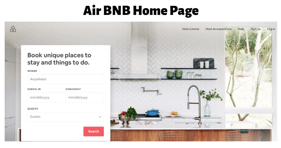
A good example of the requirements detailed above is AirBNB.
#2 Functional & Navigable
How your homepage looks is important, but what about its functionality? A great customer experience equates to an easy time finding what they need.
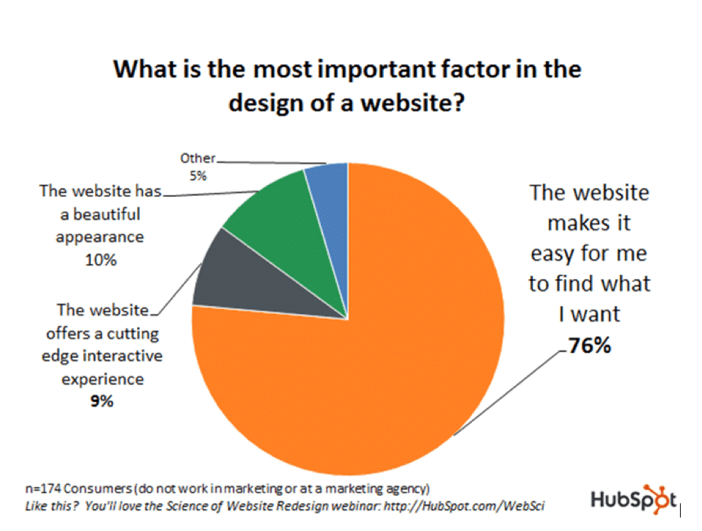
Don’t allow your customers to go through the trouble of having to click through a billion other pages just to find what they need. Granted, they won’t even stick around for long if they can’t find what they’re looking for.
How easy it is to use takes precedence over how it looks. The best example for this is Craigslist.
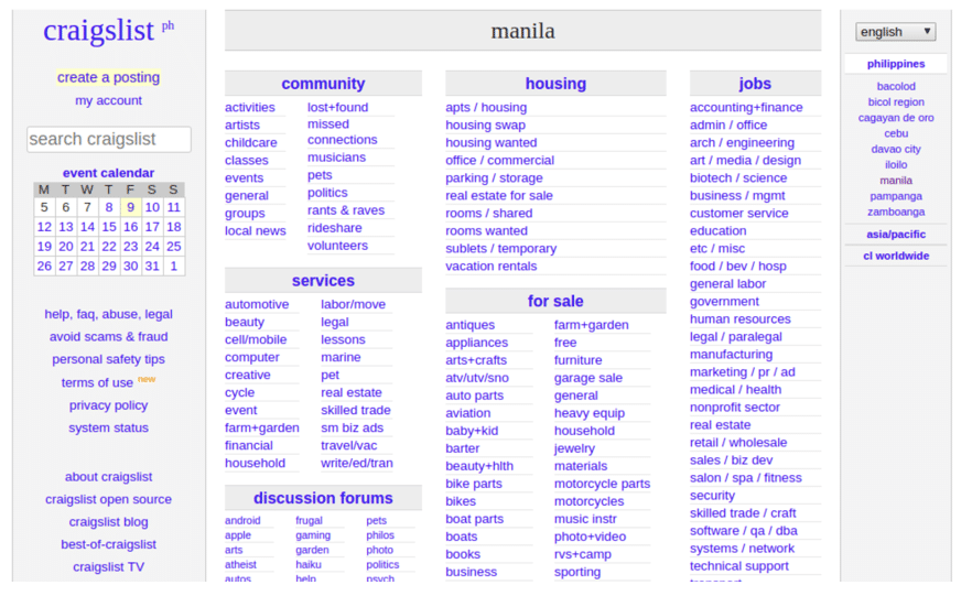
It’s “ugly.” Craigslist has remained unchanged since 1995. There are no banners, no fancy logo, nothing. You come in, you get what you need, and you get out. But why are they making millions? And more importantly, why is Craigslist still so popular to so many people?
The simple answer is the ease of navigating and its functionality. It’s useful, and gives you a wealth of categories that are intuitive.
If Craigslist makes this much, just imagine how much more brownie points your brand can get with a well-made website and very user-friendly one.
On this note, let’s talk about your website’s navigability. It has to be intuitive and effortless. Your site’s organization, the links to follow, your menus; your visitors should be able to explore these things without extensive searching.
#3 Organized Structure and Site Content
Your website shouldn’t read like a book, and that’s because your customers don’t read it like one. They look for snippets of information, they scan down, find what they need, and then leave when they’re satisfied. For this reason, all of your headlines, your announcements, your product descriptions, your CTAs, etc, should be even easier to see and to read.
Make use of dividers, or blocks to neatly segment your content titles or labels. Don’t underestimate the power of arranging grids either.
#4 Establish an Emotional Connection
Your website is very powerful when its coupled with establishing an emotional connection with your target audience. Let your target audience know that they’re interacting with actual human beings rather than just a machine.
And how do you establish an emotional connection with your target audiences? The simple answer lies in content creation.
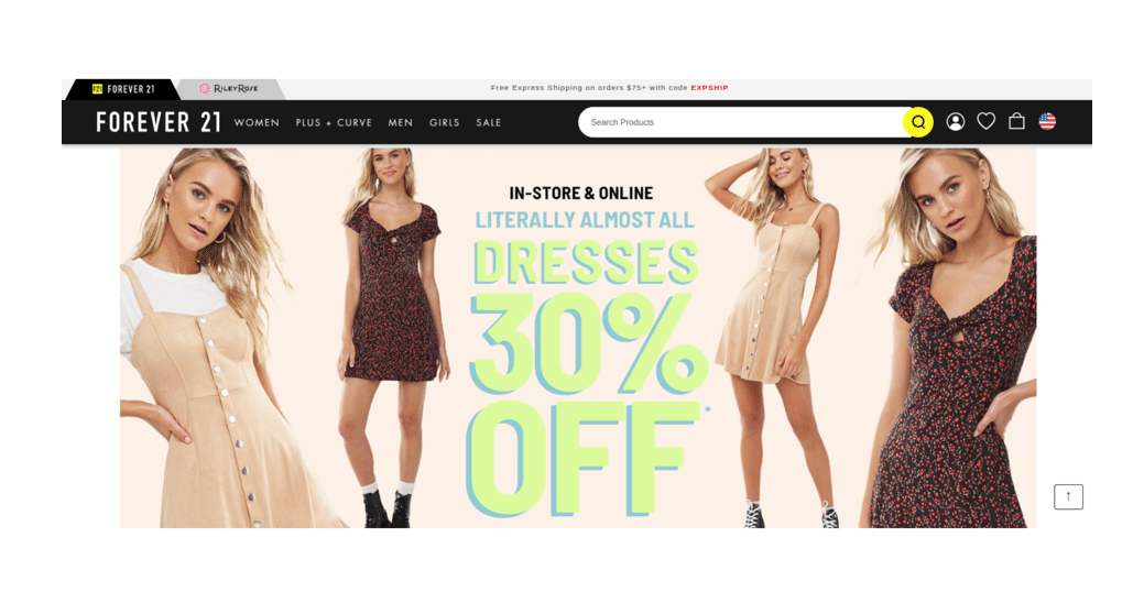
- Show human faces: Regardless of the other elements that are present, we as humans are drawn to our fellow humans. We’re social beings. So, use actual images of you and your team at work instead of just grabbing random stock photos.
- Tell your story: In addition to visual storytelling, there’s power in text storytelling too. Because when customers associate your brand with positive emotions like joy and happiness, they are more likely to convert as returning customers. Try telling an inspirational story, and see where it will take your brand.
Branding your Small Business – The Basics
Your Brand Message: Who Is Setting the Narrative?
#5 Website Speed & Accessibility
The number of people using smartphones to access the internet and to make purchases are numerous. Your website shouldn’t just be mobile-responsive; it must be mobile-first. It’s now the standard by which customers judge and measure their customer experience.
In addition to mobile accessibility, both your desktop and mobile site also needs to load quickly. Site speed is a major factor that impacts your customers’ experience and also your search engine rank.
If it wasn’t obvious enough, customers hate waiting for a full one minute for a site to load. It should be up and ready in 5 seconds or less, or you risk losing them.
Some small changes you can make to impact your site speed include:
- Think of white space in the overall design of your website.
- Disable autoplaying multimedia elements.
- Optimize all of your images to load quickly.
Great Website Design Equals Excellent Customer Experience
Your web design is an influential tool that holds so much potential. It lets your customers avail of services and purchase products; and it lets you make a living and establish your brand as credible and professional. 5 Signs You Need A Website Redesign
Web design is much more than just interfaces and visuals. It’s all about excellent user experience too. Your customer’s journey is in your hands.
Bio:
Alice Brown manages content for Global Sky, and spends most of her time keeping track of the latest customer service trends. She is a firm believer of providing great user experiences for every customer — online or offline.



Share This Article
Choose Your Platform: Facebook Twitter Google Plus Linkedin