Guest Post by Natasha Lane
The power of great visual design is outstanding. It plays one of the most significant roles in directing consumer purchasing behavior, and on websites, it also supports trust and credibility, minimizes bounce rates, and helps SEO. It’s natural that you should invest in a beautifully designed website to make your business stand out.
Since visuals are so important, you’ll want to ensure you choose the right ones. Whether your brand uses photography, illustration, video, or animation, these are the tips for choosing the best visuals for your website.
Be Consistent with Your Brand Image
One of the essential things to keep in mind when choosing visuals for your site is consistency with your brand image. What does this mean?
Well, your business plan and branding strategy should cover the goals you want to achieve with your brand’s online presence. And these should include guidelines on the audience you want to reach and the message you want to convey. Moreover, they should give you an idea of how you should communicate with your customers, that is, how you should use words and visuals to achieve the optimal voice for what you want to say.
When choosing photos and illustrations, this means that you will want to stick exclusively with the visuals that are relevant to your brand and your products.
It can be a header that shows off your most popular products – like in the hero image below from Mannequin Mall.
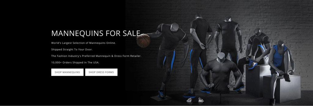
Source: mannequinmall.com
Or it can be a photo that helps your web visitors identify with your brand’s offering, like in the case of Jacquie Aiche.

Source: jacquieaiche.com
Pay Attention to Image Quality
One of the biggest faux pas when choosing visuals for your website is going with subpar image quality.
Sure, almost 55% of all website traffic in 2021 does come from mobile devices, which means that most people won’t be needing large image dimensions to get a good experience. But that doesn’t mean you should risk a poor user experience for people visiting your site from a desktop device.
For example, Squarespace suggests using images that are 2500 pixels wide to avoid blurriness on large screens.
… But Don’t Go Too Big
While you do want crispy visuals for your website, you have to remember that large files don’t do well with site load speeds (which are pretty relevant for minimizing bounce rates).
To get the most out of your visuals, learn about image file types. For photos, you’ll do best with JPGs. However, if you’re using graphics (especially those with transparent backgrounds), go with PNG.
Keep Things Real
One of the best tips for choosing visuals for your website is that you want the images to be as authentic as possible. (After all, authenticity is what consumers want from brands in 2021).
And what better way to keep things real than to show off your products in a real-life setting?
Show your products in action with detailed product photography, like Away does.
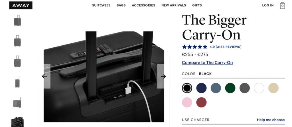
Source: awaytravel.com
Or, if you’re selling digital products, you can use in-app screenshots like Later or even pack previews as done by Spores in the brand’s latest collab announcement.

Source: later.com

Source: spores.app
And, if you’re looking for even better ways to drive authenticity with the visuals on your website, it’s not a bad idea to consider pulling images from your social media profiles. For example, Orizaba Original embeds posts from its Instagram feed to paint a picture of the lifestyle its products will fit. Plus, this strategy allows the brand to make the absolute most of user-generated content.

Source: orizabaoriginal.com
Put Some Excitement into Your Value Proposition
Though the traditional way to use visuals on your website is to show off your products or set the tone for your visual branding, it’s also possible to utilize images to display relevant data or describe user benefits.
Hopin, for example, does the latter, using icons to describe the different uses potential customers can get out of the software.
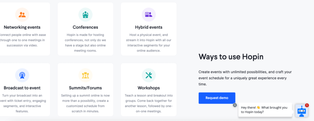
Source: hopin.com
Or, if you check out the Contentsquare website, you’ll see that the design team understood how good visuals could be at presenting quantitative data. So, they chose to create custom illustrations and improve the website UX with imagery, which describes technical terms such as page views and conversion rates.
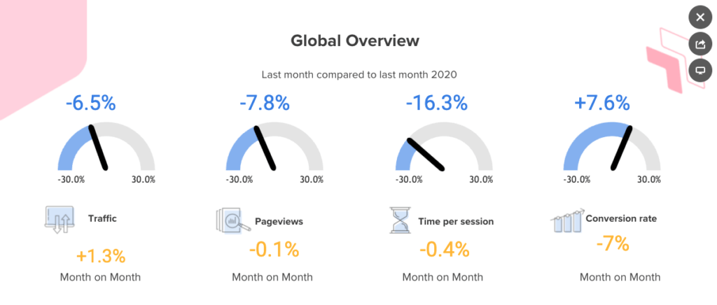
Source: contentsquare.com
Consider Using GIFs or Videos
If you’re ready to take your website visuals to the next level, you should consider using something a bit more advanced than photos and illustrations.
One of the advantages of using videos, animation, and even GIFs on your website is that they’re much better at capturing web visitor attention than plain images. Moreover, they’re engaging and can do a better job of communicating your unique value proposition without making your landing pages text-heavy (which doesn’t suit most people’s preferred way to consume online content in 2021).
So, one easy hack you could implement on your website would be to replace your header image with an engaging header video. For a practical example of this, look at the one on the Rain or Shine Golf homepage.


Source: rainorshinegolf.com
If that’s a bit too difficult for you to achieve, you can get equally good results with something a bit more low-key like a GIF, which is easy to make and doesn’t take up nearly as much space as a video.
Don’t Forget the CTA
Finally, as you look for ways to choose and produce better visuals for your website, you have to remember that a great image won’t do you any good unless it serves a purpose.
Don’t underestimate the impact of a call to action and a well-placed CTA button. These will ensure that the people who notice your website visuals continue interacting with your website. They might convert into buyers or just further explore your site and brand, thus turning into leads you can nurture with targeted marketing messages.
Don’t Be Afraid of Getting Creative

Source: unsplash.com
When choosing the best visuals for your website, these seven tips are sure to give you a head start. But, you have to understand that following a formula won’t be enough to make your brand stand out.
Just like your content and social media strategies require a creative touch, so do the images you choose to display on your site. So don’t be afraid to do some experimenting until you land on the solutions that fit your brand. Most importantly, make sure you’re communicating well with the graphic designer in charge of the project. Whether you’re hiring a fancy agency or just a newbie graphic design freelancer for the job, mutual understanding and a willingness to collaborate will be the key to success.
And, of course, don’t forget to test. A simple A/B test will give you the data you need to know about how different visuals perform on your pages and whether anything requires your immediate attention. Plus, it will provide valuable insights into the types of visuals your web visitors like seeing so that you can take the guesswork out of the design process and choose the pictures that are more likely to work for your brand.
Share This Article
Choose Your Platform: Facebook Twitter Google Plus Linkedin