What Your Web Visitors Should See First
Having a well-designed website can make or break your business. A responsive and intuitive site can lead to more website conversion, which will only benefit you and your business. Though it might be easier to hire a company that handles website design, you may decide to build your site on your own. One of the best ways to optimize your content is to pay attention to what you place above the fold. In this article, we will be talking about the term “above the fold”, what it means, and how you can use it on your website.
What Does “Above The Fold” Mean?
Back when publishing was just starting out, the term ‘above the fold’ was used to define content that was presented in the top half of a newspaper page. When newspapers were prominently displayed in newsstands, text that appeared above the fold was more viable than other text. Which in turn, prompted readers to buy the paper. When publishers switched from hard copy to digital copy in the 1990s, this term stuck. However, the difference now is that the term means the top of the site the reader is viewing, rather than ‘above the fold’ of a newspaper.
Why Should You Pay Attention To It?
You should place the most important content above the fold, where visitors are likely to look first. By placing interesting and relevant content at the top of the page, you can keep readers on your site for longer and boost your website conversion. This is why it is important to use it to your advantage. You should be posting attractive content there to catch your audience’s attention and prevent them from clicking out of your web page.
What To Include Above The Fold In Web Design
A lot of business owners don’t know what kind of content to include above the fold. Here are a couple ideas that can help define your brand to your audience:
Logo
Keeping your brand consistent among your website is important to your audience. To do this, make sure that every one of your web pages has the same header with your logo or company tagline to represent your business.
Site Navigation
Setting up site navigation is an important factor to have on your website, and it should never be below the fold at any time. Make sure that you list all your pages of your site in the navigation, as well as make it easy for your audience to use.
Call To Action
Placing a call to action on your web page is vital to your business’s success. However, it’s important for you to tell your reader what to click, what to call, to help them get their business. To do this, make sure you place a call to action above the fold of your website to get their attention and sell your product or services. These calls to action can be a simple phrase such as ‘Call us Now!’ Nevertheless, your main goal is to get them to perform an action to get their business.
or Call now!
Newsletter
Setting up a newsletter list is vital to keeping your customers up-to-date with company news and promotions. To do this, build newsletter signup on your website that is easy to find, such as above the fold of your site.
Links to Social Media Profiles
Your social media pages play an important role in your overall web presence. This is why you should make links to these pages as easy to find as possible.
Search Bar
If you have a large or complex site it is a good idea to include a search feature. This can help your audience to easily navigate your website and find exactly what they are looking for. Make sure that the search bar is easy to locate, most likely somewhere in the top half of your site.
New and Important Content
Anything that is new and important to your business should be prominently displayed above the fold. This could be a new blog post or a promotion for an upcoming event. Consider using a scroller to display all of your important information.
Above The Fold On Mobile Devices
More people are browsing on their smartphones these days, so businesses must pay special attention to how their websites look on mobile devices. This, however, makes it harder to optimize your webpage to fit the above the fold model. This is especially true because mobile device screens come in all different sizes.
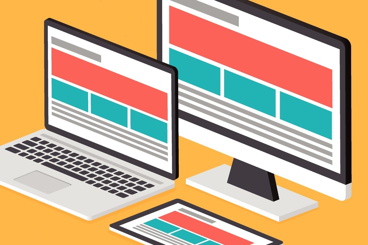
Additionally, most people browse the web with their phone’s in portrait mode. This is the opposite of traditional, landscape web design, which is why it poses an added difficulty. This is where the aid of a website design company could be useful. It is important to focus on using a responsive design for your business’s webpage. This includes using a flexible layout, cascading style sheets, and images. Responsive websites do not have set layouts. Instead, the page content optimizes itself for any size screen.
If you are interested in getting more traffic to your site and more leads to you can: contact Cowlick Studios website design windsor, OR you can download or handy Do it your self 47 Point Checklist that gives you all of the points to check for an effective website design.


Share This Article
Choose Your Platform: Facebook Twitter Google Plus Linkedin