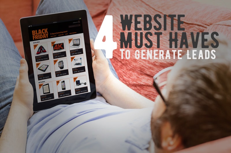
Ever wondered why you are attracted to some website design and not to others? Or wondered why you interact with some sites and not others? These 4 website design must haves will help to answer that question. Using these on your own website design will help to increase leads and sales on your site. A web design company can help you accomplish these tasks if you are not confident doing this yourself.
1. A Great First Impression of Your Website Design!
Researchers have proven that a web user forms the first impression of a website homepage in as little as 50 milliseconds! A prospect can make judgments about a web site’s visual attractiveness within the blink of an eye.
Having an award-winning website design is not the most important element of a website, but if you fall below a basic standard of design quality, your potential customers lose trust – no matter how big and successful you really are.
Even in the age of the internet and inbound marketing, people still want to buy from people. Be authentic and be transparent. Use real images and include a personality behind the brand. Face to face you can easily build trust, so should your website. Online first impressions are often a last impression.
2. A Good Website Design answers “What do you do”?
If a user can’t figure out exactly what you do in 3-5 seconds or less, your website design will fail to capture them as a lead or sale. Be obvious, if you are a restaurant, tell them exactly what kind of food they will get; “Greek Food Served in a Family Atmosphere”. It is unmistakable what you get if you go to that restaurant. You can see on our website exactly what we do – “We build beautiful websites…”. Your website homepage should also be this simple to gain the eye of the browser.
3. What is the Problem You Solve for the Browser?
The text for your website design should answer the problem you solve for your target market. This is not a history of your company or an about us page, but this text speaks directly to the problem your target market is having and how you solve it. Also remember that you have 3-5 seconds to answer this question. On our website we are speaking to anyone who has had a bad experience with a website building tool or with a web design company. We say “No Hassle” and then our tagline reads “You have many options when hiring a web design company, our No Bull Guarantee makes certain you get a fantastic finished website that increases revenue.” This is text that we tweak occasionally but for the most part we are trying to tell our target market that we understand their problem and are trying to provide a solution to that problem.
4. How to Contact You?
A great website design makes it clear how to get a hold of you. This is not a “contact us” link in the main navigation. This includes visible phone numbers on every page, clear calls to action like; “schedule a meeting”, “download now”, or “register today”. If you have a professional website design, answered the basic 3 questions, then your web browser should contact you.
You can download our 47 Point Homepage Checklist to learn more about how to improve your website design and functionality or check out this post Seven Ways to Double Website Leads.
Make these 4 changes to your website design and you should see an increase in leads from your website. If you are not sure about how to implement these on your website, contact us and we will be happy to help.


Share This Article
Choose Your Platform: Facebook Twitter Google Plus Linkedin