How to Craft High-Converting CTAs
The Call To Action or CTA is one of the most important elements on any website. Whether you are selling products or services or even just running a blog, you want people to perform certain actions: sign up for your newsletter, make a purchase, get in touch. These are all conversions.
How you craft your CTAs can significantly impact your conversion rates. So, let’s take a look at seven tips and examples that can help you make yours the best they can possibly be.
Highlight the Key Selling Points
A Call to Action button or title should highlight the most important selling point of your product or service. Something simple, like “click here” or “sign up,” is okay but rather generic. It does a very poor job of telling your audience what it is they are actually getting.
On the other hand, if you add a simple word or phrase to the CTA that gives a bit more information and provides a more compelling reason to convert, you can spark more interest.
This may be using a phrase like “Start 14-day trial” or “Get started for free.” This is how Optimal Workshop does it, and their CTA works very well. It highlights the fact that you can start using their product practically instantly, without having to think about the amount it will cost you. If you are satisfied with the service, you can then choose a pricing plan that fits your needs.

Source: optimalworkshop.com
Answer All Questions
Ideally, you want to make sure that your audience knows exactly what they are getting into when they click through your CTA. This may not always be possible, of course. Your tagline and top-of-the-page copy just won’t be enough to give them all the necessary information to make an informed decision.
When this is the case, you can do what WP Engine has done very cleverly: send your audience to learn more. They give you a choice: do you want to check out their pricing, which is a major decision-making factor, or would you rather check out the different products they offer.
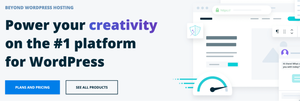
Source: wpengine.com
This is an excellent solution for websites that sell more than one item or offer more than one service. Instead of trying to anticipate what a user needs and limiting the reach of the CTA, you literally provide answers to everyone.
Offer More Than One Option
You can apply the same tactic even if you don’t offer more than one way to convert. For instance, if you have a free trial available or if there is one set price for the product or service, but they may be niche or particularly intricate.
Aura gives you two CTAs: one for starting a trial and the other for learning more about the way their solution works. Since Amazon repricers may not be a commonly used tool, they have anticipated that some of their users may want to get more information before signing up.
Source: goaura.com
You can swap out your CTAs periodically too. Leave the one that offers a direct conversion, and use the other one to promote your newsletter, a specific sale, or a recent post on your blog.
Use Powerful Words
In order for a CTA to be as impactful as it possibly can, you need to strategically select the copy you will use in it. You don’t want to be too broad or too general (“click here” is a prime example of the kind of CTA you don’t want).
On the other hand, you don’t want to be too specific either. You don’t want to put too much pressure on a single word to convey your entire brand ethos and message. Unless you have done some focus groups and identified just the right phrasing, you can inadvertently choose the wrong power word and alienate your customers.
Writing a great call to action can be tricky but with practice it gets easier. Body Alchemy uses a unique CTA. “Turn me into a shredded athlete” is definitely much better than “get started.” However, there are certainly members of their audience who will cringe just a little bit. There will be visitors who are interested in getting fit but who don’t want to become shredded per se.
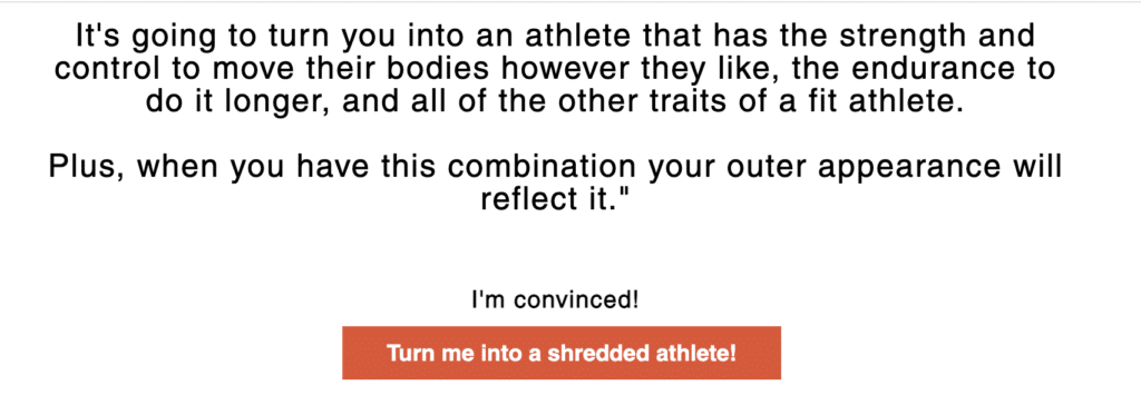
Source: bodyalchemy.me
In this particular case, something a bit more muted, like “Become the strongest version of yourself,” may have been a better solution.
Make Sure It Stands Out
The purpose of a CTA is to grab a visitor’s attention and to ensure they perform the action you need from them. If it’s too small, too hidden, and too understated, it’s not really serving its purpose.
How you will make it stand out is up to the design of your homepage. You can:
- use a vibrant or contrasting color scheme
- make the font and button very large
- use exclamation points
- animate your CTA, etc.
However, you need to make sure that this one button isn’t so distracting that it takes away from the rest of the page. By all means, make it the first thing a visitor sees, but then let them also notice everything else.
Semrush is a good example of this tactic. Their bright orange CTA is certainly the first to be spotted: but it isn’t overly obnoxious, and it works very well with the purple background.
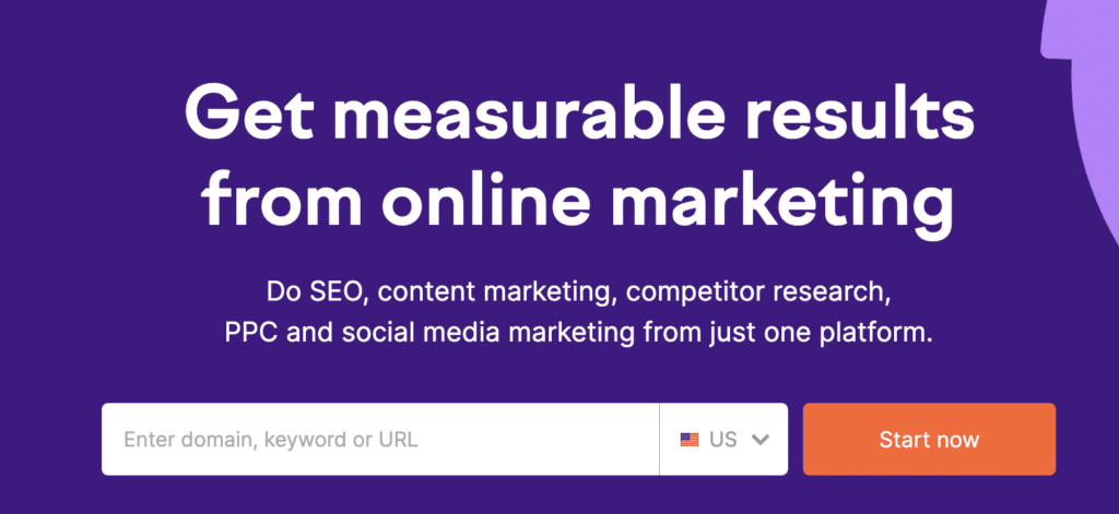
Source: semrush.com
Or Keep it Mellow
If your branding is a bit more understated and if you want to keep your design more professional and clean, you don’t have to make your CTA pop that much. It still needs to stand out and be easily distinguishable from the rest of the page. But it can be a lot more mellow.
Take a look at the Pretest Plus. Their CTA is white, yet it’s very easy to spot. It certainly gets all the attention it needs, but the entire feel of the page is a lot more smooth and relaxing. Where Ahrefs used a vibrant blue, Voices went for a softer touch.

Source: pretestplus.co.uk
Make it Personal
Finally, you want the CTA to be uniquely yours. You want it to align with the brand, speak to your audience members specifically, and communicate your message clearly, without it sounding just like every other similar website your visitors have likely seen.
A good example to check out is Ultimate Meal Plans. Their “Meal planning made simple” CTA is very short, but it’s different enough and speaks directly to the audience. It’s not so much about the brand as it is about the user and what they can expect to get — easy meal planning.

Source: ultimatemealplans.com
It also implies a personalized service: not all accounts are the same, so find the one that will suit your needs specifically.
Final Thoughts
CTAs come in all kinds of shapes and sizes. If you nail yours, you can quickly expect to see an improved conversion rate and a rise in sales.
Guest Post By:
Natasha Lane
Professional Writer and Digital Marketer
www.natashalane.io
Cover Source: depositphotos.com

Share This Article
Choose Your Platform: Facebook Twitter Google Plus Linkedin