When Nike paid for their logo design, they spent all of $35. This was in 1971, but even with inflation, talk about a great deal!
You may not understand how to design a logo for branding, but you do understand the impact one would have on business. Major brands are easily recognized because of their memorable logos.
Learn more about what makes a company’s logo design stand out from the rest.
1. Keep Your Logo Design Simple
A simple concept for your logo design will take your brand further than an over complicated one. The simpler your logo, the more versatility you will have in using your custom logo design outside of your website. A clean, uncluttered image will stand out more easily in your audience’s mind, too.
Intricate details are often lost when changing platforms, whether the image scales properly or not. Every element of the design should convey your brand, from colors to fonts, and other decorative aspects.
2. Determine the Desired Style
One way to keep your logo design for your company simple is by selecting a particular design theme or style. If you need a more impactful logo, consider a strong style. The stronger your logo, the more iconic it can become.
A balanced style should incorporate the text or graphic of your brand with a correct color scheme. Color is another fundamental aspect of a business logo design style.
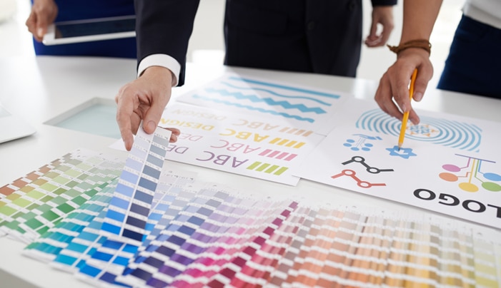
3. Strategic Color Use in Your Logo
Color use is all the rage in logo design. Consider color psychology when deciding how to use color in your design. In the theme of keeping your logo’s design simple, you should only use colors that evoke your brand’s message.

You may alter colors in your logo based on the platform(s) you use it on. Your color scheme should also be flexible enough for going black and white when not used in digital mediums.
4. Branding Starts With Your Logo Design
At this point, if you do not have a clear image for your brand, your logo design can cement that for you. If you need help crafting a brand strategy that clearly promotes your business, you should consider consulting a professional marketing group.
Whether you use traditional, digital, or a combination of both types of marketing, you need a recognizable brand. A well-made graphic design logo can be used in any type of marketing strategy to maximize audience recognition.
5. Use Quality Typography or Font
Typeface or fonts used in logo design are often overlooked. Typography is important for graphic design. Simple typefaces convey different emotions and messages than those with serifs or fancy swirls.
Depending on your brand and industry, one font is certainly better than the other. Wording should be limited, though. Too much text limits your scalability across platforms and materials. If you invest in typography, it’s important to not skimp on the details.
6. Your Logo Design Should Be Scalable
We have mentioned scalability a few times. This largely depends on the file type used in your logo design. There are vector files and bitmap files. Vector art is the way to go for scalability or the ability for images to change sizes across vectors.
Raster, or bitmap, files are great for online graphic design logo. Vector files give you versatility for matchbox-sized images or billboard advertising, in addition to your virtual application on a website.
7. Make It Memorable
A memorable logo design is unique to your brand. You do not want the same cluttered, predictable logo trends of your competition. A memorable logo should avoid swoops, wooshes, and pinwheels.
Clip art is the number one thing to avoid.
It looks cheap and unprofessional. The last thing you want is customers confusing your brand with another simply because of logo similarity.
8. Timeless Over Trendy
A timeless logo does not have to happen by accident. Brands like Coca~Cola or Nike have set the standard for timeless because they did not cash in on the latest design trends. Instead, they pioneered graphic design basics and turned them into iconography.
There is a reason swooshes are now considered cliched in the graphic design industry. You can avoid logo design cliches by using the fundamental elements listed above. Your logo can still be a timeless one if you use the right elements. This list will help you decide if you need a graphic designer or if you feel you can accomplish a logo on your own.
- Explore conceptual icons that reflect your brand
- Use the space available for a clean, polished logo
- Consider lower or upper-cased fonts for part or all the logo
- Appreciate the differences in handwritten or digital fonts
- Your tagline should be a smaller font than your company name
- The tagline and brand name should be aligned for balance
- Avoid cramping your text and/or images
- Consider a background color for contrast
- Alignment of all design elements is important
- Consider making images the same size as the font
These are just a few general tips to consider when aiming for a timeless logo design. By no means do you have to include every aspect included here, but if you so choose, they can certainly help create a brilliant, potentially iconic business logo design.
Who Makes a Brilliant Logo? Where You Should Turn for Your Branding Needs
Whether you need a rebrand or you are starting a new business, you now understand the importance of top-quality, well-crafted logo design. Your logo should be consistent across all of your marketing and digital material. If it is not, or you need an evaluation, consider Cowlick Studios.
Our professional services can help you with all of your graphic design and branding need. We cater our designs to your business’s personality and aesthetic. To learn more about what we can do for you, contact us today.

Share This Article
Choose Your Platform: Facebook Twitter Google Plus Linkedin