Did you know that half of all website visitors judge your online credibility based on your site’s design? A staggering 94% of users claim that a poor website will make them leave and not return. Mobile visitors who have to enlarge a page to view it end up switching to a competitor.
Yet many businesses ignore their customers’ wishes and don’t even have a call to action or a marketing strategy in place. This article offers 5 tips on how to create a modern web design for your site that will increase traffic and improve sales.
Learn how to attract and keep a new audience visiting your website through SEO and Core Web Vitals. Discover why a clear navigation structure and content layout are essential. See why building a beautiful website to promote your brand can also offer a great user experience.
Read these 5 essential modern web design tips on how to create a site that is attractive and watch your visitor count rise.
1. Use Responsive Web Design
Ever since the launch of the iPhone in 2007, the web design industry realized it needed to build sites for smaller screens.
The average width of a phone in 2021 is between 375 and 414 pixels. Traditional websites will either ‘squeeze’ into that space or disappear past the edge. Users have to pinch and zoom to view content which is a frustrating and offputting experience.

Modern techniques use responsive web design meaning they work well on any device size.
Style sheets can now recognize the width and pixel ratio and serve custom content accordingly. That simply means that a mobile browser will have its own look and feel while still retaining the features of its desktop cousin.
Google’s Responsive Web Design Guidelines
As a mobile platform developer, Google wants what’s best for its users. Its Android platform is designed for phones and tablets and the search engine giant wants them all to have a great user experience (UX).
Google issued guidelines on responsive web design a decade ago. These apply to corporate companies as well as one-person outfits and everyone in between.
The rule of thumb is to make sure your site works on every screen size. Otherwise, you may slip down the search engine results pages (SERPs) because of your content layout. Try and focus on the page experience for mobile visitors as it often gets neglected.
2. Clear Navigation and CTAs
Websites vary in their aesthetics, style, delivery, and content. Yet one factor remains present in all great websites: clear navigation with a structured hierarchy.
Users may be bowled over by your landing page and fancy graphics but your bounce rates will soar if they can’t see your links. Pages like ‘Contact Us’ are an essential part of every site yet many designers hide these links or leave them out completely.
Review the sites that work best for you and examine their navigation structure.
You’ll soon see a pattern emerge and can implement those features into your own site. However, don’t forget that every page needs to have a purpose.
Call To Actions
A CTA or call to action drives your visitors to do something, or you can also use them in your content marketing strategy.
The CTA on a product page is the ‘Add to Cart’ button. For promotional sites, it could be signing up for a newsletter.
Buttons often activate a CTA. For example:
- Submit a form
- Read more
- Social share
- Contact us
At Cowlick Studios, we ensure our modern websites include CTAs that clearly tell the visitor what we want them to do next. Nothing’s left to chance and you can track those responses using our analytics tools.
3. Employ a Content Marketing Strategy
Quality content plays a huge role in Google Search results, as great content is rewarded with top rankings.
If your site contains stale content then you’re missing out. You need a content marketing strategy that will appeal to visitors and search engines alike.
This often takes the form of a blog where you write news articles and dedicated pieces.
These should focus on your products or services and offer something unique. Lean into your own knowledge to create fresh insights. Use headings and lists to attract better SERPs positions and improve your SEO.
4. Incorporate Core Web Vitals and Local SEO
In May 2021 Google launched the Page Experience update to its search service. This focused on improving UX by improving website loading times.
These Core Web Vitals consist of:
- Largest Contentful Paint – how long your site takes to appear
- First Input Delay – time taken for your page to become interactive
- Cumulative Layout Shift – when does the page settle to become readable
Understanding and implementing Core Web Vitals is the key to success for modern websites.

Your pages must appear and become usable within seconds. They need to work on all browsers and devices. And loading images should contain a width and height style to restrict moving content.
Local SEO
Customers searching for businesses in Ontario turn to Google’s local search features. A local SEO campaign can do wonders for brick and mortar business, for both service and product based companies. Pulling in more foot traffic with local SEO can be a great way for more potential customers and can even work for corporate companies.
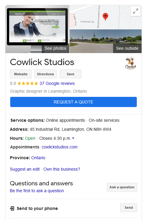
The Google My Business service is free to set up and is an excellent marketing tool that you can tap into. The panel displays opening hours, telephone details, map directions, and other useful elements.

Contact us to discuss how Cowlick Studios can help create and maintain your GMB listing and get better serps positions today to better market your company.
5. Build Beautiful Brands With Great UX
The final tip involves building a website that grabs your visitors from the outset.
Nothing instills confidence in a brand more than a professionally designed home page. Potential customers instantly spot a good website from a poor one and associate those emotions with the company.
Adding out-of-place stock imagery or a clipart logo won’t cut it in the modern world.
Your site needs to reflect your values, ethos, and branding. It must be custom-built and unique, just like you. A $10 WordPress theme won’t work if you’re trying to impress.
Thankfully, our team always builds a custom site for our customers. The result is a web presence you can be proud of that in turn will attract more business.
Modern Web Design Tips From a Modern Team
Modern web design isn’t just about great graphics, animation, or fancy fonts.
Users need your site to work on all of their devices. They also have to find you on Google so your website must be search engine optimized. Once they arrive, they should enjoy their visit with a workable navigation system and great content.
If your Candian website is underperforming then it’s time to call a modern web design team.
Cowlick Studios develops websites that work.
Based in Leamington in Ontario, we take pride in delivering modern solutions for our clients from start to finish. We take outdated and poorly designed sites and transform them into marketing tools for your brand.
Schedule a meeting today to see how we can help modernize your business online.

Share This Article
Choose Your Platform: Facebook Twitter Google Plus Linkedin