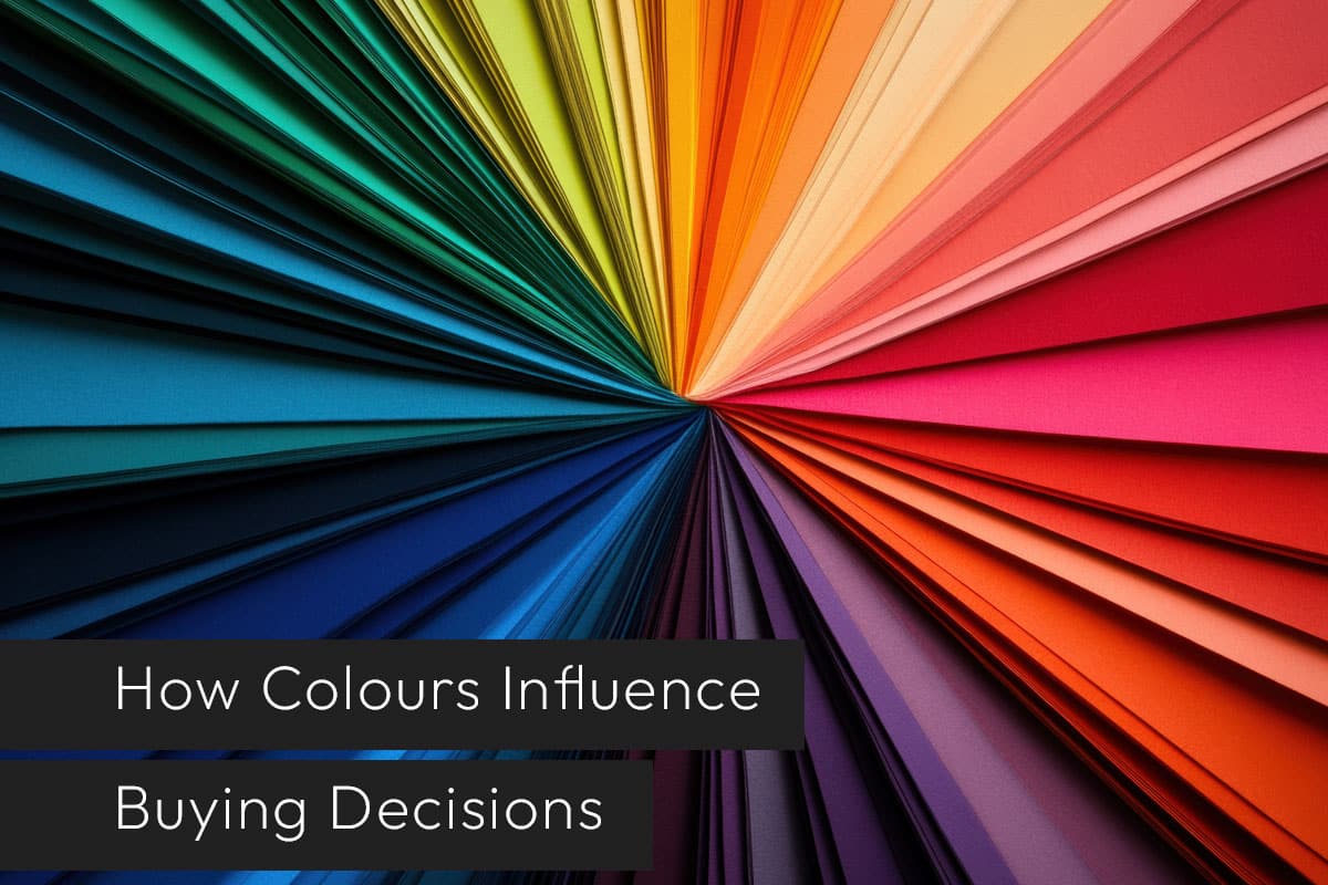
Colour has a big impact on how people see your brand. It can affect whether a customer chooses your product or service. The colours you use in your logo, packaging, and marketing materials influence how customers feel about your business.
Using the right colours can make your marketing more effective. It can also help your brand stand out. Here’s a quick guide to common colours and what they communicate:
Red
Red grabs attention. It creates a sense of urgency. That’s why it’s often used in sales and call-to-action buttons. Red is energetic and draws the eye, encouraging immediate action.
Black
Black shows sophistication, luxury, and authority. Many premium brands use black in their marketing. Be careful, though—too much black can feel heavy or overwhelming.
Green
Green represents balance, growth, and calmness. It works well for brands that focus on health, sustainability, or financial stability.
Blue
Blue builds trust and shows reliability. It is popular in banking, healthcare, and technology. Blue makes your brand look credible and professional.
Orange
Orange is warm, energetic, and inviting. It works well for calls to action. Orange inspires excitement and encourages people to act.
Yellow
Yellow is optimistic, friendly, and creative. It grabs attention and creates a positive, approachable feel for your brand.
Purple
Purple communicates creativity, sophistication, and luxury. Many premium brands use purple to stand out and give a sense of elegance.
Choosing the right colours is more than aesthetics. Colours shape how customers perceive your brand. They can increase engagement and make your business memorable. By understanding what each colour communicates, you can make smarter marketing decisions and create visuals that resonate with your audience.
Share This Article
Choose Your Platform: Facebook Twitter Google Plus Linkedin